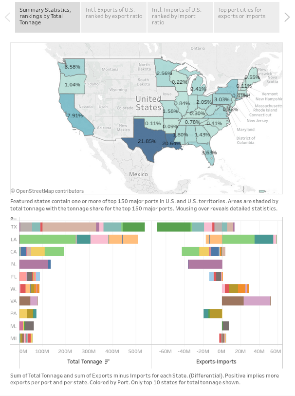
This is a study of the top 150 ports for the U.S. and territories, data comes from the Bureau of Transportation Statistics. Note all specific values are for shipping tonnage and shipping value is not discussed in this study. This is about the scale of raw material moving in and out of U.S. ports.
The longterm goal is to better understand U.S. commercial infrastructure and grow more comfortable with common methods of procuring and analyzing this data.
Tableau
This is the first study I'm putting up with Tableau, while things look nice and I like how interactive the visualizations are I'm still worried I don't have control over hosting the data.
This is a "story" with four slides that can be clicked through. The main points I'm hoping to understand are the shipping volumes by state, by port, and the corresponding export/import volumes.
Port Tonnage Study
Source: https://public.tableau.com/profile/wolfgang.m1740#!/vizhome/PortsBook/ShippingTonnage

I can't imbed this visualization story right now, so here is the first sheet but please click on this link to view the entire Tableau story. (Four sheets total.)
Some takeaways are the massive shipping structures of Texas and Louisiana, likely Oil & Gas related materials. Washington has a large exporting infrastructure comparatively. California has the largest importing structure comparatively. When broken down by port, Houston holds the title of largest importer and exporter by tonnage. Impressive!
Comments
There are no comments yet.