I've had fun with Tableau recently, but I've had to trust Tableau's data processing and sometimes settle for what the software can do and not what the data can do. One particular area is working with geographic data. So I've decided to learn software for Geographic Information Systems.
Perhaps the most notable GIS software is ArcGIS, but this is paid software so I continued my pattern of exploring open software and have decided to use QGIS. I chose QGIS for its large established community.
Alright, I've got a long ways to go, but I wanted to share a quick visual examination of some GIS data to show how quick and powerful geographic data can be. The Houston Police Department makes available recent crime data so I've grabbed the latest issue to look at.
HPD Recent Crime
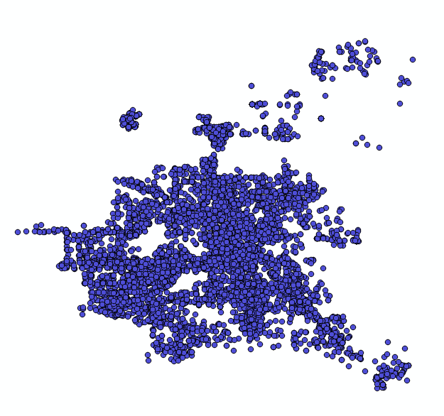
Here is the data as you first see it. Just a collection of points with associated reports. You can see some curiousities already. Open "crime free" areas within the city and some geographical shape to the border of the city.
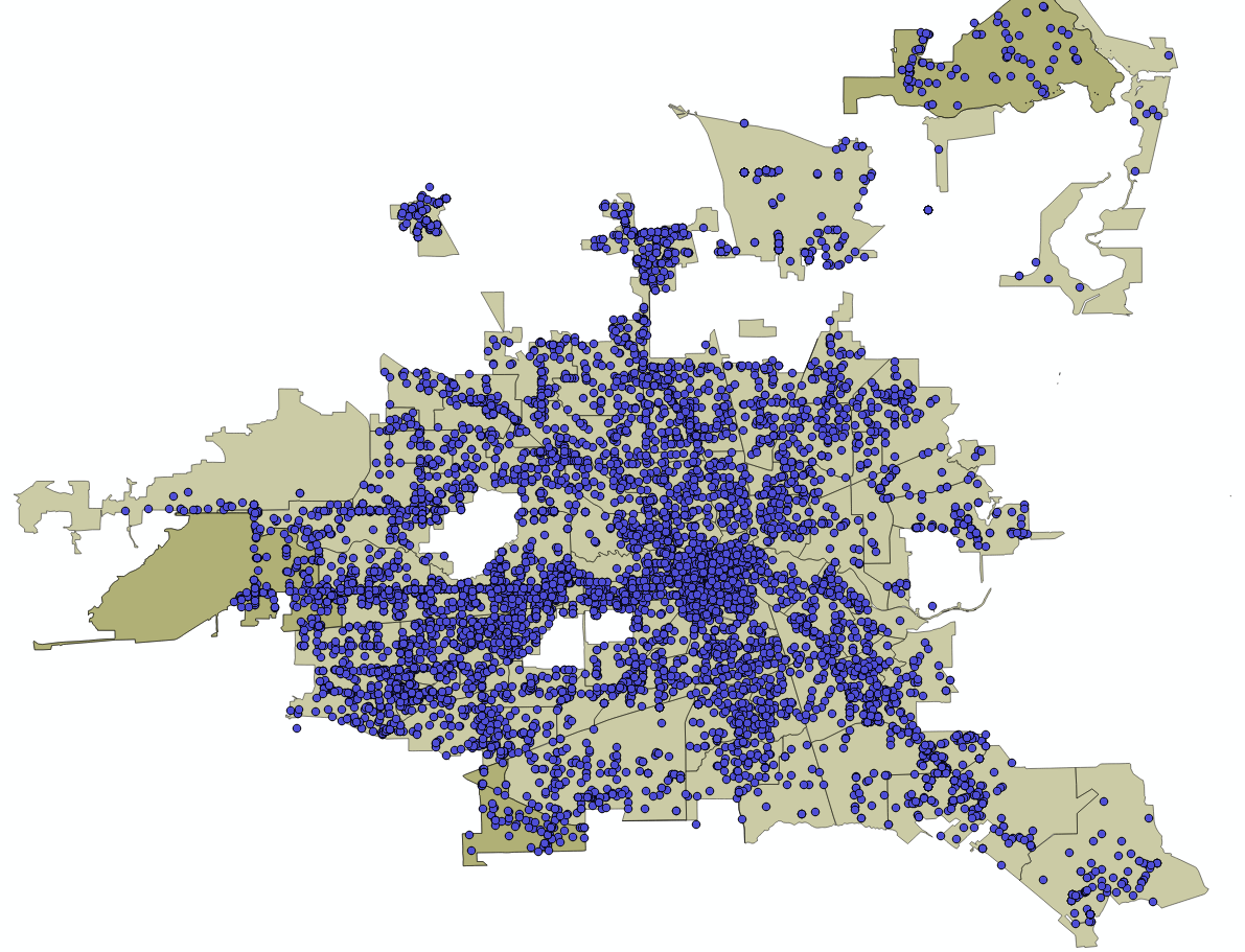
Now I'll start adding layers to better understand these patterns. Here I add Zillow's neighborhood data which includes shape files that trace out residential neighborhoods. This does an alright job of orientating someone who is familiar with Houston. Now you can see the Buffalo Bayou boundary, the Bellaire cutout, even the neighborhood shaping by 610.
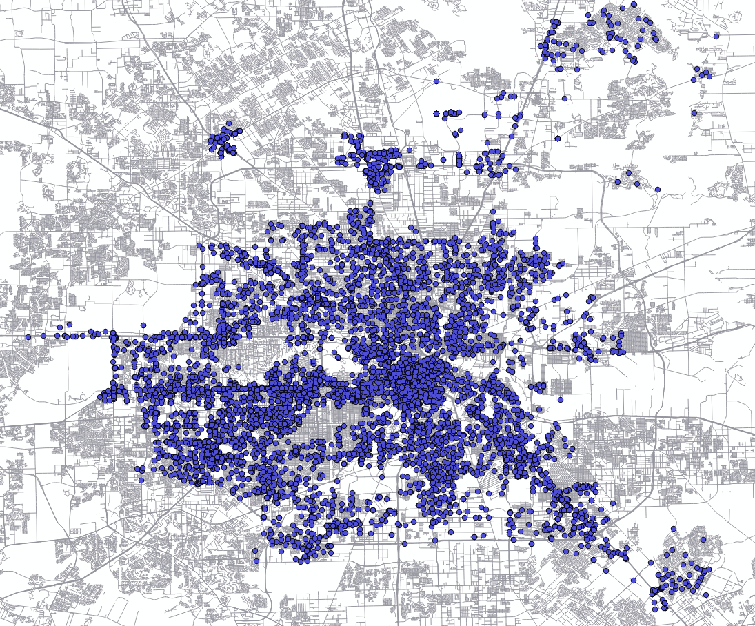
However there was something I was noticing when I zoomed in that I needed one more layer to tease this answer out from the data. Here I use TxDOT's road map of Texas as another layer. With GIS software, layering multiple map layers is mostly automatic and highly accurate. Now you can see the effect of roads and freeways. You can see the I-45 to Galveston is a strong area of crime and downtown has a heavy general level of crime.
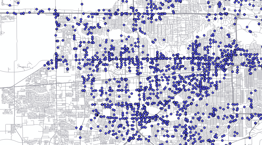
This final zoom section focuses on SW Houston where you can see what I consider to be the most interesting part of the data visually. (Also personally.) Here we see multiple horizontal bands of crime. While I'd expect to see that around I-10, I also see it around Bissonnet-S.Braeswood but especially all along Westheimer. Even higher prevalence of crime than I-10!
Based on just this shallow exploration with GIS, I'd consider Westheimer to be a "highway to crime" considering it is only second to the I-45 corridor in directional crime prevalence.
Note: These dots are often overlapped address data, I found many addresses which had 7+ recent crimes reported. (Last month or two.)
There's so much more to learn from this data so I'll continue. I hope you enjoyed this look at GIS data and you avoid Westheimer late at night. (Just last week a friend of mine was robbed on Westheimer.)
Comments
There are no comments yet.


