What was the economic impact of Hurricane Harvey on the price of gasoline? I can answer this personally from a Houston perspective and say it pushed my $2.09 to $2.35, and immediately after the storm it was common not only to experience prices around $3/gallon but shortages in availability.
A quick note: $2/gallon equals €1.70/gallon equals €0.24/Liter. Scanning Berlin, Germany now I see €1.35/Liter there.
So before I look at anything I should go ahead and check how much it's already been looked at. I found a CNBC article that claimed there wouldn't be much of a general impact but noted the RBOB gasoline futures jump of 6.8%. First thing first, what is RBOB? RBOB description linked here. Then of course CNBC's tracker is linked here.
Now let's say I'm not satisfied clicking around on their website and playing with their provided tools, though they have an impressive list of built in browser tools, I want to download this dataset. I'll go back to my favorite source, Quandl. The exact thing I'm looking for EOD/UGA, but unfortunately this is listed under the Premium databases. Thankfully this only makes me go sideways. I found a free version listed under FRED/DRGASLA, downsides are it hasn't been refreshed in two days and it appears to describe gas prices in Los Angeles... But I'm just looking for historical trends so this will work. They also have a source for weekly and monthly, but I always look for the finest data (daily) and transform it if I need to.
The Daily data looks pretty messy. I'd like to smooth it out, but first I'll address some of the CNBC trader's lack of concern. Here is the daily price data over the past 14 years.

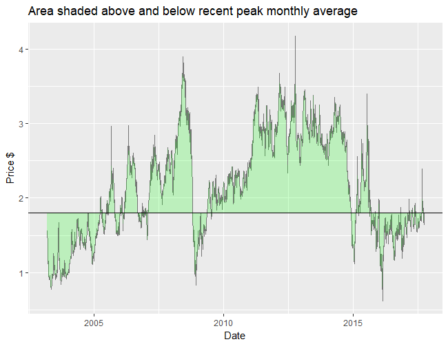
Since the peak as you can see to the far right of the graph was a little extreme, I found the average price for that peak month instead. This chart shows the area above that month's average and below for comparison. This shows in the past two years this price stood out somewhat, but seems more in line with the prior decade. Since prices have dropped back down after this recent peak we don't appear to be approaching the higher price levels of the past decade yet.
I'd like to go a little deeper in the analysis of general trends so if interested read on.
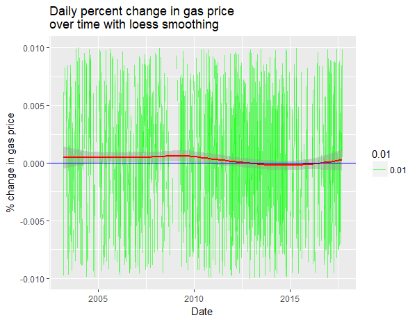
While the daily data looks messy I can go ahead and use it for a daily % change in price seen here.

This data would be overwhelming if not for a loess smoother showing a trend with predicted values. A trend along the horizontal 0 line would indicate a steady fluctuation, but instead we see our trend (in red) is hovering slightly below a 0.001% daily increase in price. The trend only dives into a negative rate around 2012 and reemerges in 2016. What does this chart illustrate? Well for one it suggests someone graduating in 2014 would've had the absolute worst timing this generation to try and get into Oil & Gas, unfortunately. But also in my opinion we have discovered the normal inflationary rate of gas price and also seen the dramatic change brought on by the 2010's Oil Glut. We might expect the rate to stabilize again at 0.001%+ daily.
Now I'm going to smooth things to a more manageable level visually, I'll be going with a monthly average.
Note: Monthly averaging is smoother than monthly sampling
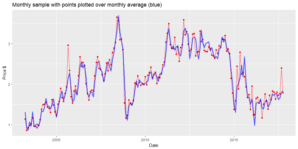
If I collapse monthly my Daily report using their built in function it is in fact sampling at monthly intervals. I could use their FRED/MRGASLA dataset which provides the monthly average, or if I only have access to the daily report I can calculate the monthly average in R. How big can this difference be?
 Here is a chart showing monthly average in blue. The red line represents the monthly sample and appears more erratic. To emphasize how strongly these individual samples can differ from the average, I have dotted the points as well. Since my goal here is to smooth my chart, I will take the monthly averages.
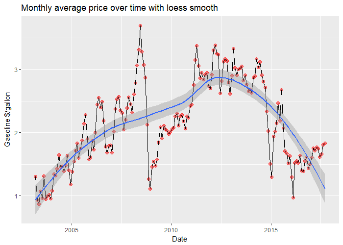
Now that I've made a monthly chart I can plot and examine its loess curve.

Well, there it is. It isn't very convincing. Other curves follow the data too well for me. Even though I've smoothed things to monthly averages, individual months still appear dramatic particularly around 2008. Do I buy the loess curve? No, but any better trend predictions will have to wait another article. Thanks for reading.
Comments
There are no comments yet.