There's some talk in the news about economic policy at the federal reserve taking a turn to start increasing the federal funds rate. Fed president Janet Yellen has indicated on what conditions she will raise it and it appears increasingly likely.
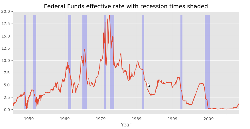
Raising rates is meant to tamp down inflation, but shouldn't it also quiet down investment and economic growth? That's an open question and to help answer that I wanted to graph both federal funds rate and years of recession.
To do this I'm using Quandl's data sets, specifically their Federal Funds Effective Rate and their Recession Indicators.
Here is the code I'm using:
import quandl
import matplotlib.pyplot as plt
from matplotlib import style

style.use('ggplot')

quandl.ApiConfig.api_key = 'my_api_key_here'

#Effective Federal Funds Rate
df2 = quandl.get("FED/RIFSPFF_N_WW", collapse="monthly")
df2['Value'].plot()

#Recession, 1=recession
df4 = quandl.get("FRED/USRECP", start_date="1955-01-01")

maxY = df2['Value'].max()
y2 = df4['Value']
plt.fill_between(df4.index, 0, maxY, where=y2 == 1, facecolor='blue', alpha=0.2)

plt.xlabel('Year')
plt.title('Federal Funds effective rate with recession times shaded')
plt.show()
Note: I swapped my unique API key with a placeholder, you can run this code by deleting that line to access Quandl as an unregistered user. As an unregistered user you have low call limits.
So what does my code produce? Exactly what I wanted of course, as you can see here:

Full confession, this isn't the most unique connection to make, and it's one that's largely uncorrelated. Most of the fun here is just figuring out how to shade under and over a line to replicate an effect often used by Financial Times and others. The key part is making it variable based on the data itself. That'll be useful for later.
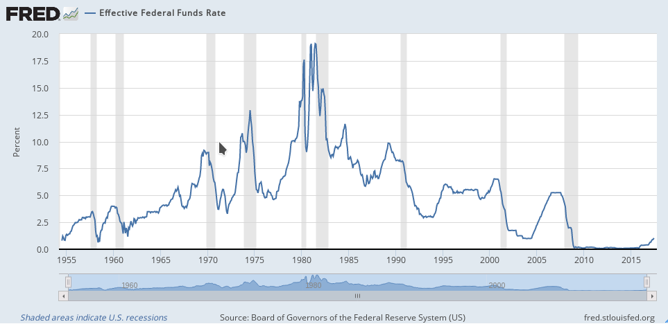
Now for a real world example, here is one from the St. Louis Federal Reserve.

Comments
There are no comments yet.